Candidates, Why go through a recruitment agency ?
1/ Your chances of finding a job are multiplied If you respond to a job offer published by a recruitment agency, your application will not…
Many of your projects have a common structural/architectural theme of a white ‘shell’ that seems to frame the glazed facade (VIlla Marbella, Bridge House, East West Villa, etc.). Could you, please, describe the structure of that element?
Bringing outside inside and the inside out is a theme which can be found in the early glass houses by Ludwig Mies van der Rohe. This theme works in Dutch environments where there is not always enough footage to build on. It can have an effect that inner spaces can be experienced as bigger. It also allows for the sun to come into the house. Therefore the windows are designed for maximum inside outside relationship, getting the sun in (morning sun in breakfast area, afternoon sun at living room terrace, etc).
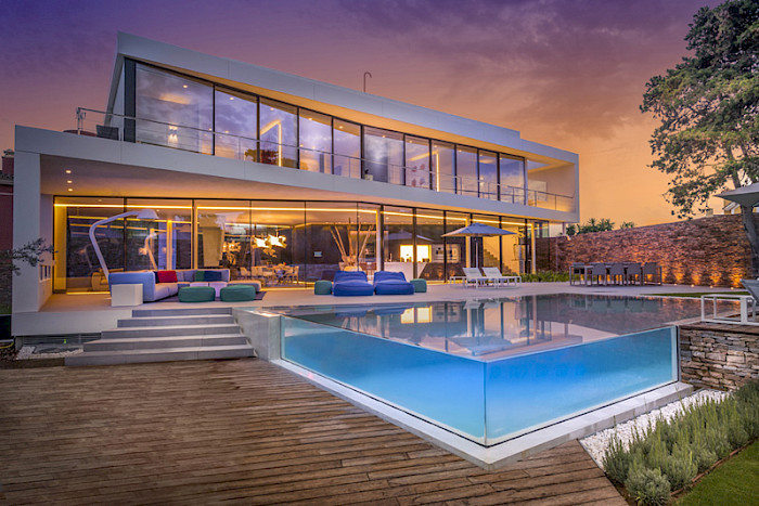
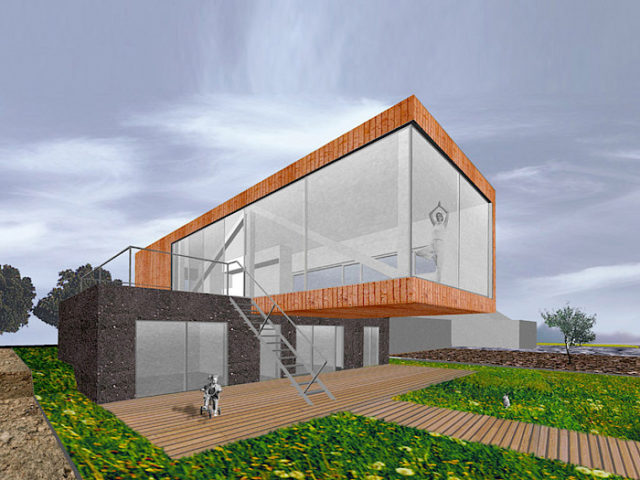
For Villa Marbella (called Cool Blue Villa) the idea is to integrate the villa and the garden. One single element (slab) frames the views windows ), transforms into a terrace, then into a carport and incorporates the swimming pool. It is also a play where inside and outside blend into each other. For example, where the stairs go to the first floor, and the roof terrace going from inside to outside within the building – the surrounding slab frames the view towards the sea.
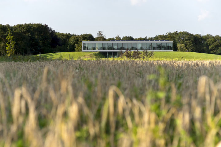
In case of Bridge House the garden is 15 acres of park. There was the issue how to create the best panoramic view. For a better overview we created a hill of the leftover soil (of transforming the farmland into a park) and put the villa on top of it. So this should allow a more overview of the garden and better panoramic views. Furthermore the whole facade is glass equipped with sliding doors and framed by minimum building. So, all the rooms have maximum contact with the park (view sunlight and access).
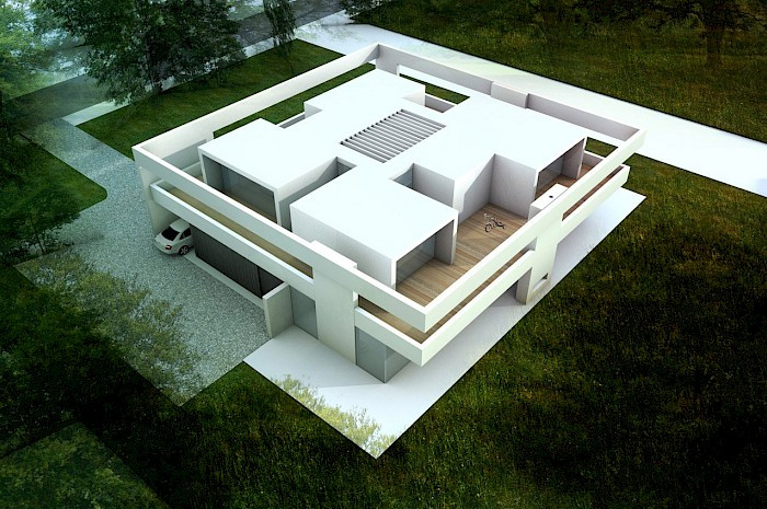
Another element which interests me in your projects is the theme of long, not load carrying beams (e.g. in Inside Outside House, Bungalow Wageningen, etc.). Could you, please describe this element, why does it need to have such a height? Is it a functional element?
Inside outside relationships can be treated in different ways, blending as if there were no boundaries. This we do if we want to achieve the experience of “infinity”. Everything is continuous without ending. Inside and outside are united. Transforming, creating an intermediate space between inside and outside. From inside to outside goes in steps. This is applied in occasions where an outside function is strongly attached to the inside. It can be considered as an outside room. The beams define the “missing” ribbons of that volume and are designed in the same style (material) as the rest of the house. It needs to have a considerable size (height) to get that affect of this enclosed outside.
What is the functional/structural purpose of the same beam-type of elements on the second floor (turning around the perimeter of the building) in the Sky Frame House?
The framing has the same meaning as described above. The outside functions as a functional extension of this inside. In this case an outside playroom for the children rooms. The connections of these outside spaces create continuous loop which can be used as a trail for running, playing, etc.
We like bringing the outside in, in two ways.
– Maximum openness as if there were no boundaries such as walls roof etc. Therefore we like to use full height windows . With the use of slabs it allows us create the effect as if the windows were the left over space between those elements. It allows us to create more “quiet” spaces.
– Framing the view to focus on and create privacy at the same time. Usually those windows become functional from a certain position. Sitting in the kitchen of Brick Wall House creates a view on who is approaching the front door. Only sitting in the music room behind the piano and sitting in the study behind the desk creates views towards each other. We like to create
the effect as if the outside is like a small painting of reality.
You have cantilevered structure appearing in some of your projects (Nesseland House, Hill House, Bsoch & Duin). What is that cantilevering architecturally and functionally conditioned with?
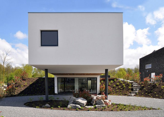
Cantilevering is the same as the use of beams-creating semi outside space. For Nesselande and Hill house it is a carport (dry walk) and for Bosch and Duijn it is emphasizing the entrance.
What is the concept of the free standing, non-functional facade wall in the Brick Wall House? Where did the concept come from?
This house has different neighbours: a typical gabled roof house on the left side and a 5 story monolithic apartment block on the right side. We got inspired by the contact of the ambiguous context and used it as a theme for the design: layering of blocks towards the left side and a monolithic wall towards the right side.